Workbook for bookmaking
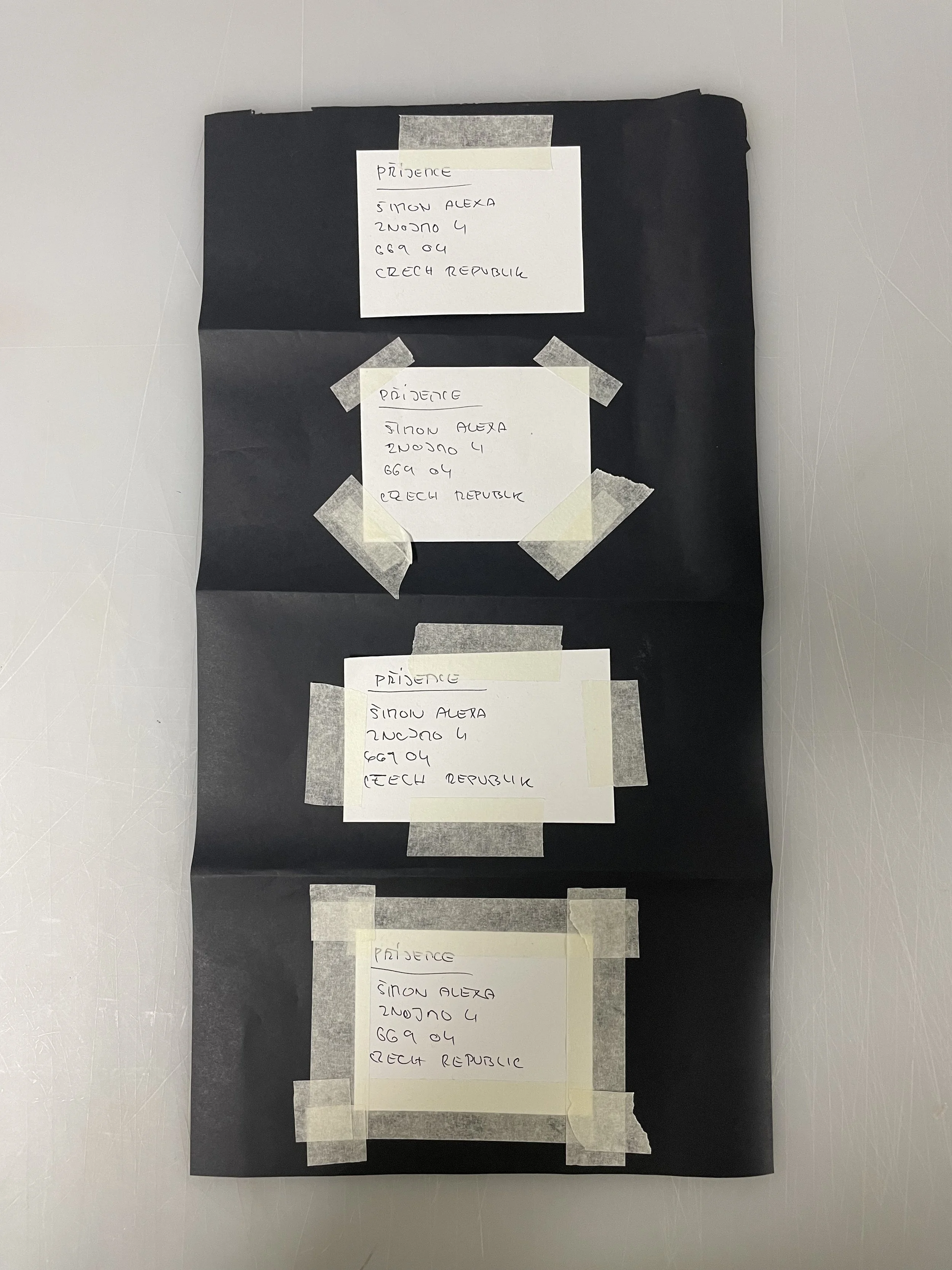
Simon Alexa
S212298
The idea for my book
Induction for bookmaking and different artists Japan hand made books
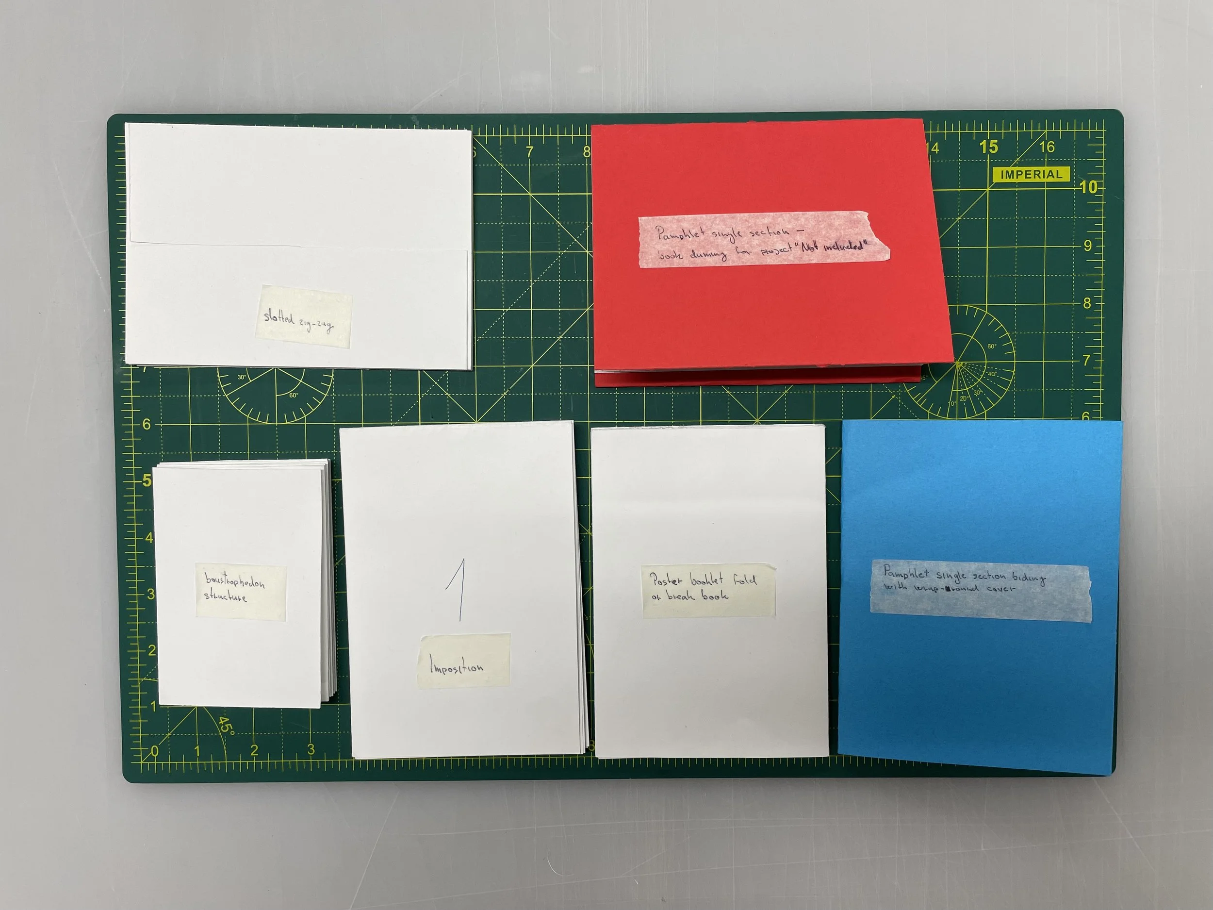
Workshops - trying different stitching methods and folding
Making a book dummy of “Not included”
Doing sequence
Why I’m doing black and white images
1st crit - just images
2nd idea of Czech culture and me in the UK
2nd workshop
Facing problems with InDesign and how to print
Deciding on what paper and size I gonna use for the final book
Printing and making zen in zen machine
Last workshop and idea to use strep around my book
Adding a letter to Jezisek to book to create an extra thing in the book
Printing and stitching non-traditional kettle stitch
Buying “book cloth” -black and yellow
Cover making
2nd more informal crit - already made a book dummy
Finishing sequence and whole layup of book
End pages
Making band overbook with letterpress
Making final book struggles
Trying different thread
Making final book with new matt paper
Self-evaluation
book reviews
The idea for my book
Before this module started in January we had a lecture in December about what we needed for it and what we are going to do. So we knew that we can use already made images in a book or make a new project along with a book. The options for me were to use last to project “Room” and “Not included”, make a new project, or try to create something from images that I have but not created a project from them so far. I didn’t want to start/create a new project because I thought that it was going to be a lot of work along with making a book. So the other option was to use the last two projects. But both of them consist so far around 10 images. What seems to me is a small number of images for a book. And I remember another project that I did last year. It was a project from the documentary module with Geoff. I was taking images of my 1st Christmas in the Uk away from the family caused by covid-19. And I have a lot of images which I didn’t use but they were good. So I started to build an idea around it. As Christmas of 2021 was closer I knew that I’m going to be again spending a Christmas in Uk. So it was a great opportunity to shoot again and make more images. I shot images on portra 400 that I have left after summer. I did photos of what we were doing and try to catch as many memories and things important things to me. I shot as well some landscapes which I did last year as well. And then I was waiting for the start of the module and when I going to be able to go to the darkroom to develop the film. And see if I can make it narrative and make a book from it.
At the begging of the module, I developed my film and the images end up good. Some of them were unfocused but overall good. So I knew that I’m gonna stick to these images and try to make a book from them. It started really slow and the first week was just induction a lecture. The second week was the first workshop and I started to gather all images from last year and this year. I also had images that I took back in the Czech while I was there for summer break. So I had around 8 rolls of film.
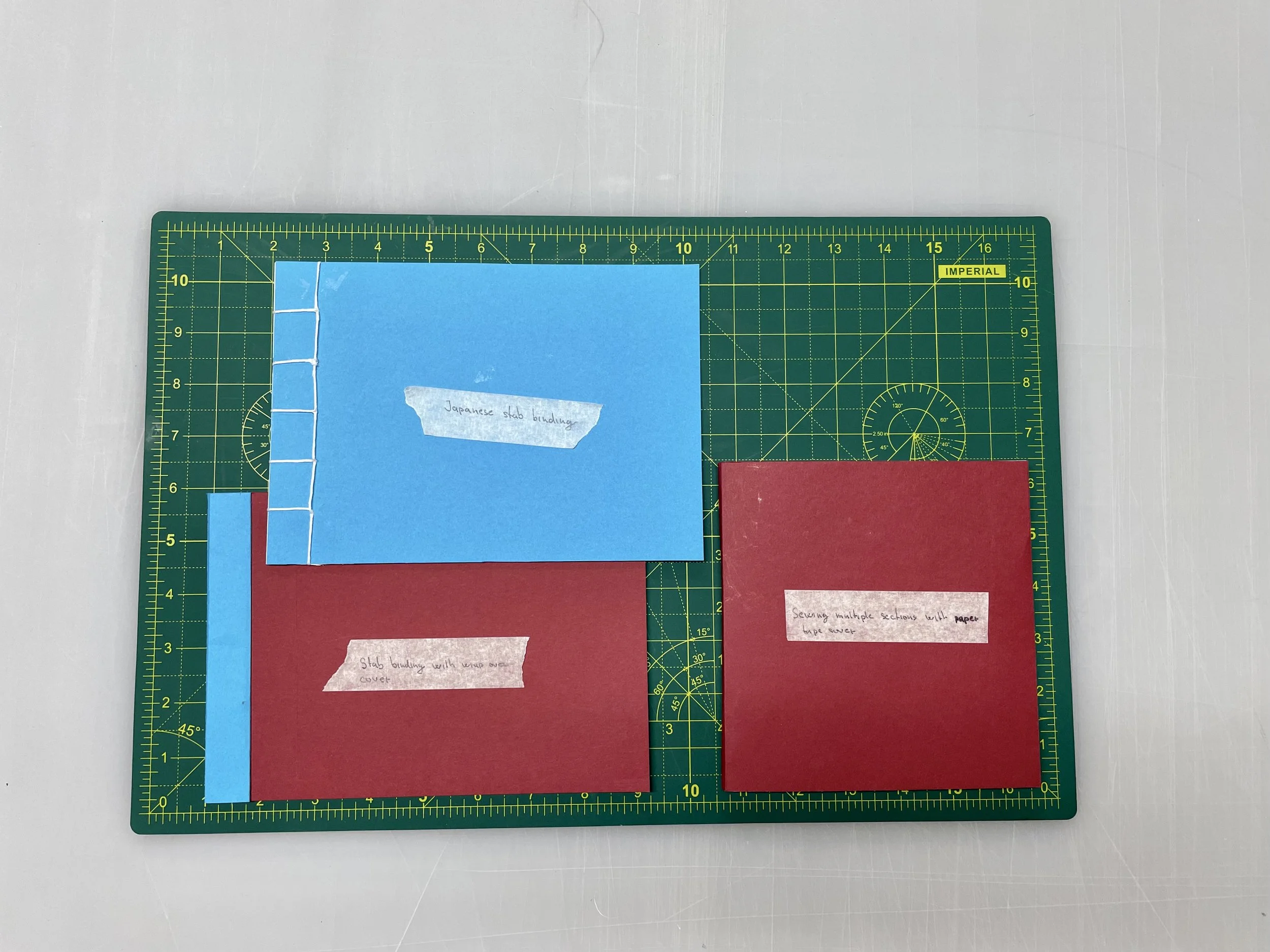
1st Workshops - trying different stitching methods and folding
The 1st workshop was about basic techniques of folding paper and making a really simple one-section book. I went to uni where we met with other classmates to do the workshop. It was good to see for the first time what we can create and it was good to start thinking about my own book. Predominately we did just folded layouts and then one section simple book.
Induction for bookmaking and different artists Japan hand made books
Next week we had a lecture where Noel Brough Japanese artist hand made books and other photography books. All different layouts and styles. So I spent around 2 hours looking at them and discovering different things in the book. Some of the things that impressed me were. A spine which we can see it. More book stitch together folded image in a box, a page which we can open and there is something extra. Notes, images, postcards in books that had plastic corners or they were free in the books. Small book as a box for cigarettes. Bigger book. Different cover, materials, text, with an image or without, plastic over cover. Different types of paper. Through some of the paper, I was able to see. And the author created images with more layers of paper. Over the image were plain tickets or over faces of people were white circles.
I was looking more for layouts of imagers and these things than on the actual narrative in the book. It showed me that I can be as creative as possible. And it doesn’t have to be a simple Photo-book with a simple layout of images. To see all the variations were really helpful and eye-opening.
Making a book dummy of “Not included”
After that, I was temp to try to do something from the workshop. So I decide to make a book dummy from my last project. So I was able to use imposition and a simple one-section book what we did. Figure out how to layout all images was more difficult than I expected. But I created a physical layout and then I was able to do it in InDesign. It was just 3x A4 on both sides printing. But it took me around 2 hours to do this layout. I printed out on cheap paper what we have in printers. The next steps were to trim it and folded to one section. I used my paper for layout and it was easy to do. Then I took color paper and thread and start stitching and after then made the cover from 1st workshop. Because it was a really simple method on how to do book dummy I was able to do it on 1st time. It was not perfect but good. I was really happy to see my project in some book form.

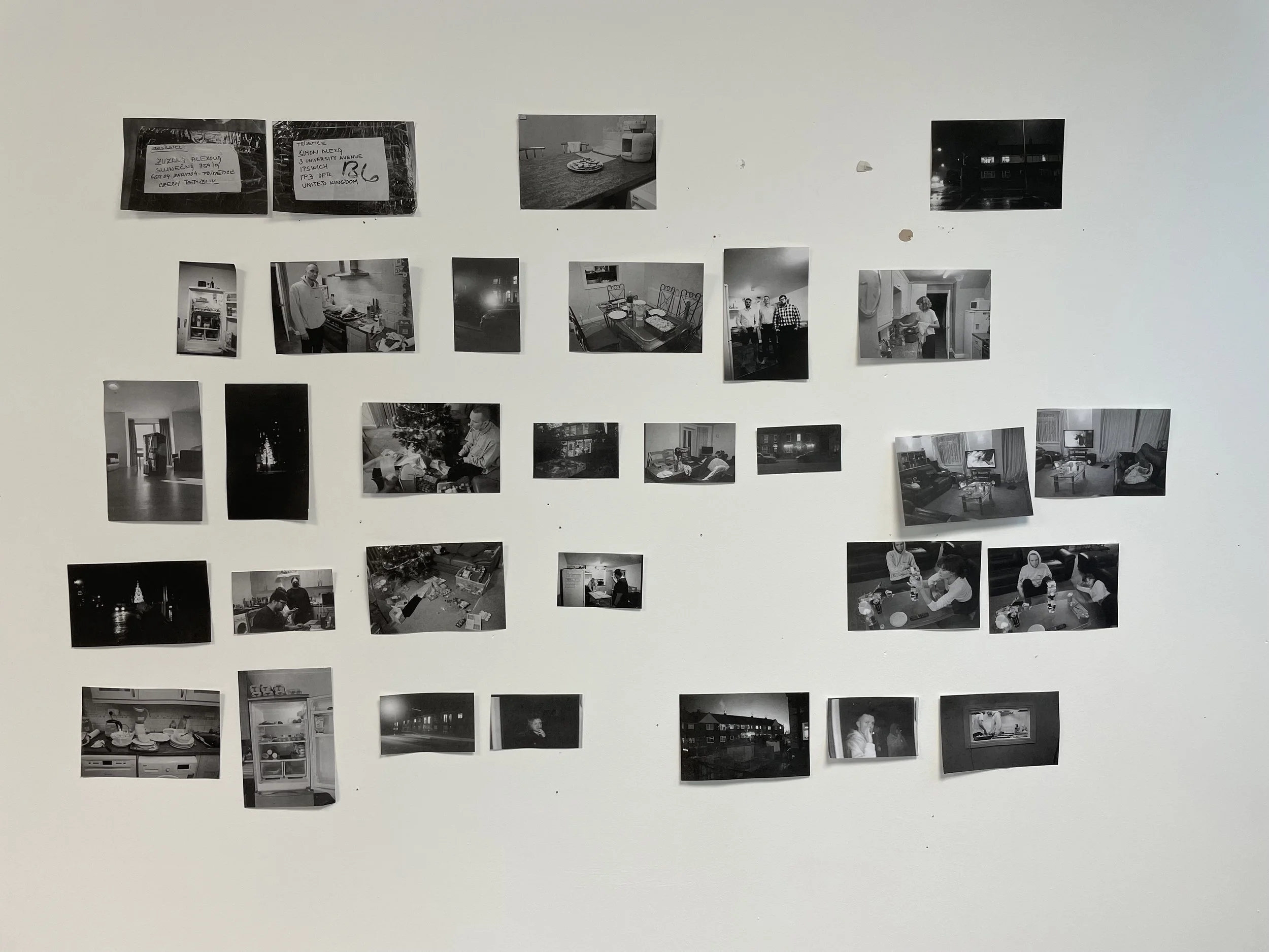
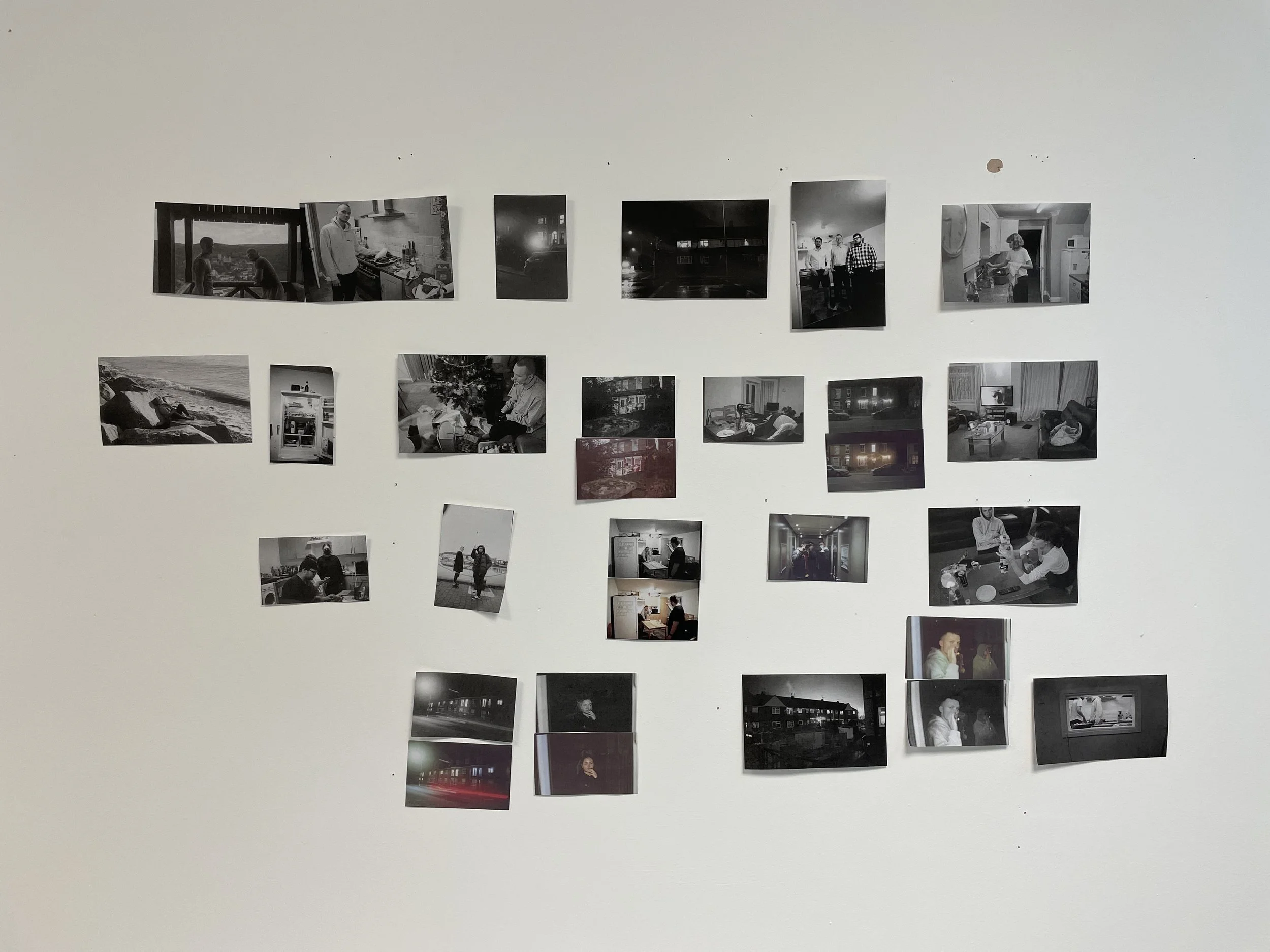
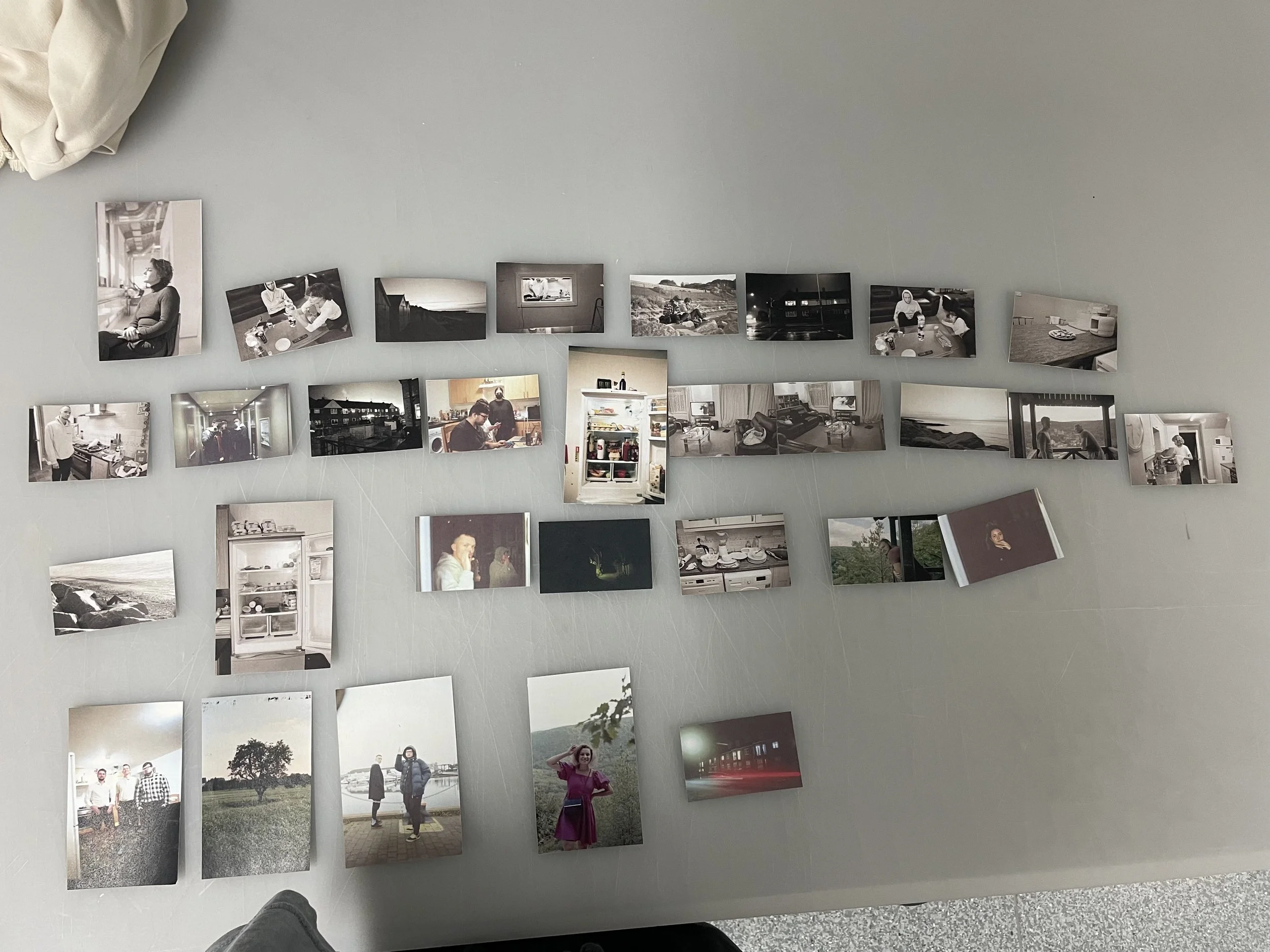
Doing sequence
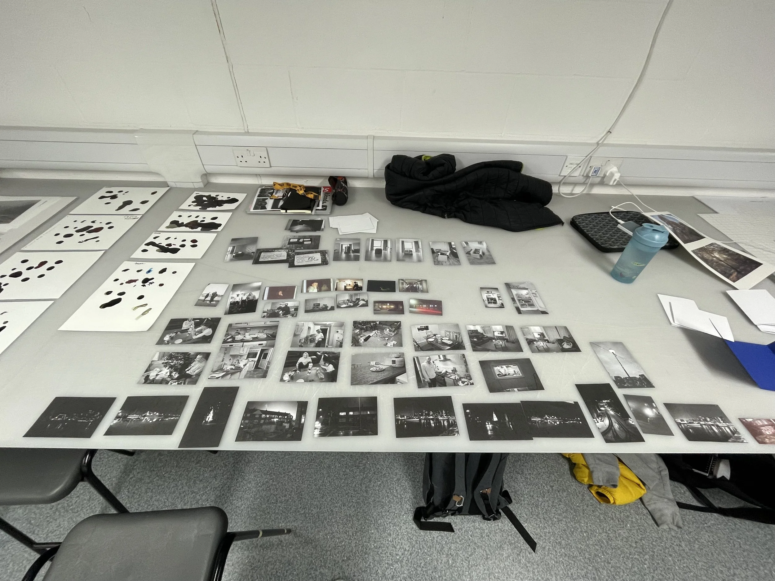
After this, I started printing all my images and choosing what I want to include and what to put aside. I again printed on cheap paper. But it’s still better than choosing on the screen of the laptop. So I lay down all my images on the table and start to choose images. I aimed for images from both Christmas and some landscapes from the time of Christmas I had around 50 images.
I asked Noel what is a good number of images in the book. He said that it’s up to me and the project, but the optimal number is around 30 images per book. I knew that I need to reduce, but then I knew I need to aim for 30 images. So I choose a little bit more than 30 images to do my sequence and try to think about how I’m going to approach the narrative.
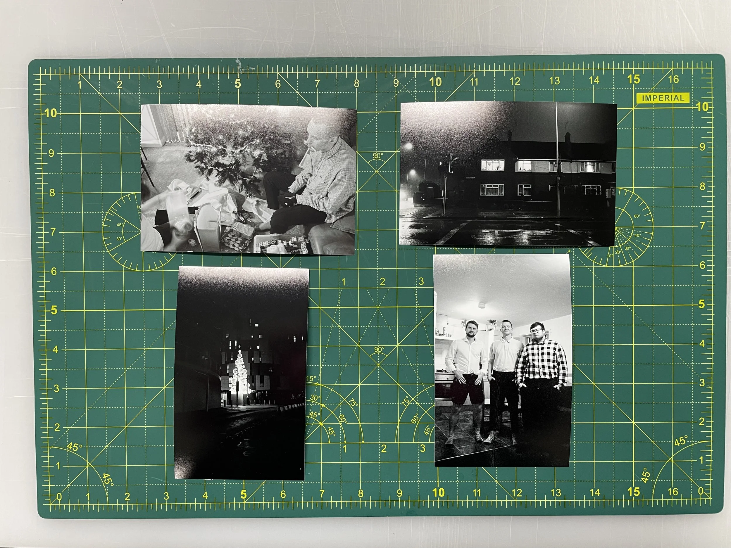
At this point, I needed to think about what I wanted to tell with this story and what the idea is. Because I already made this project, but just with the 1st Christmas I knew that I’m going to aim to show how I’m celebrating Christmas as a Czech person in Uk without family, just with friends, in times of covid-19. So I knew from the last project that I can do a sequence as a day is progressing and it was perfect for my idea because I was shooting as the went and I want to show the celebration of Christmas and us celebrating basically in one day. And I had images of the box that my mum sent me last Christmas. So I tried to implement these images to the sequence of the day of Christmas together with landscapes. And another theme in the images was a happy feeling and a sad/lonely feeling. So I tried to contrast them. I had a little bit problem doing the sequence because I knew that it was not one Christmas but two. So it was hard to make it seem like 1 day. But when I showed it to my classmates they thought that is one day. So I knew I can do it.
The sequence goes from cooking all the food to the table ready to eat.. Then present under the tree and unpacking them. After that Christmas movies and playing games together and enjoying time together. I also discover some strong images which work together.
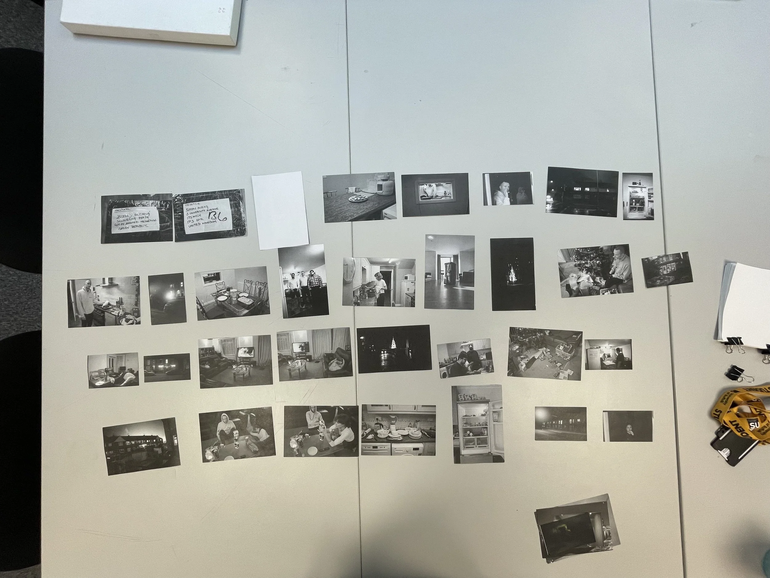
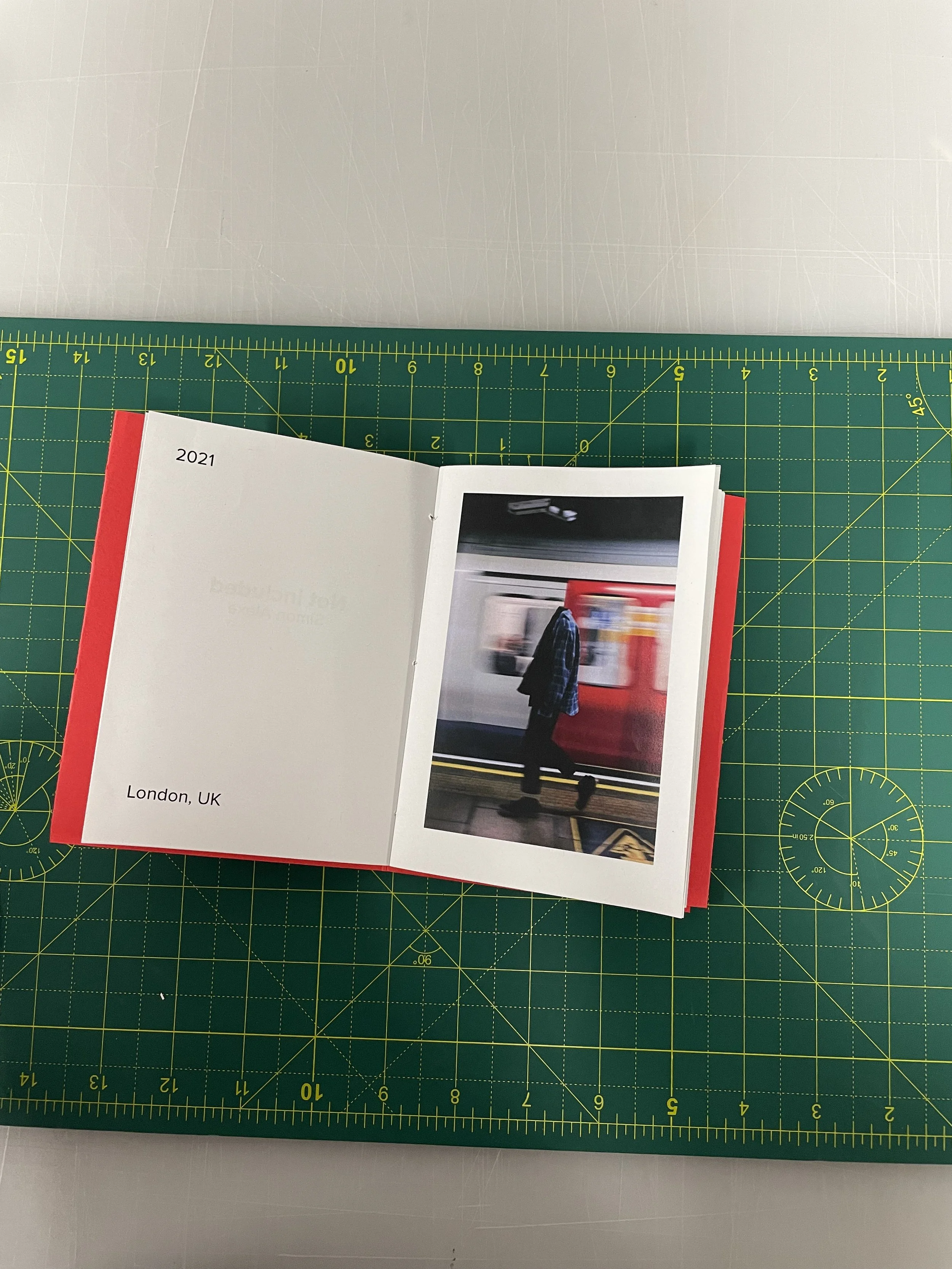
Address from the box (me and my mum’s)
Full fridge (ingredients for cooking) and cooking image
Table of prepared food and us after diner wearing shirts
Box and Christmas tree (the box which should be under the tree)
Outside of house and inside (the image of the inside can be in the house)
Two same images little bit different angle (I like how they look beside each other)
Light of car and staring Klaudia (Staring Klaudia reminds me the light of car)
Same image different time( I like how they look beside each other)
Used dish and empty fridge (sense of time after something/used)
I started to really like this sequence. I tried to think about something else and create it. But it didn’t work for me and this sequence suit the idea/narrative that I’m trying to achieve.
Why I’m doing black and white images
All images are black and white. It’s caused by the first Christmas which were shot on black and white film. The second Christmas was shot on colour film - portra, but I didn’t want to mix colour and black and white images. The easier way was to convert the colour to black and white. And it makes more feeling of one day. I would rather have them in colour, but it’s impossible.
1st crit - just images
The next point for us was 1st crit. Where we were asked to bring our images in possible sequence and the idea of our project / upcoming book. It was good to see each other work and see what others are doing. Also, Noel gave us a sheet with questions that should help to have a clearer vision of our project.
The question helped me to summarise my thoughts and be more specific. When I present my project the response was that is good, but the question is if the project just from or about 1 day is not limiting for me. And also it’s not a typical style of image to me. And Noel suggests to me if is able to make a story about me and Czech culture in Uk. I already have this in my mind, but I think I don’t have enough images for it. Nether make it from the book. But I tried to make something from images that I have printed to see if I’m able to make something
Here are images that I have for crit
And after crit I tried to make something around the idea of me and Czech culture around me in Uk
2nd idea of Czech culture and me in the UK
So this idea stick with me and I was thinking if I should continue with a story around Christmas or try to do a new one. So I tried to print new images and do something around the idea of Czech culture and me in the Uk
I like the idea and images, but still, I don’t think are enough yet. I’m going to do something in the future around it. And I have some other ideas on this topic, but for this module and book, I going to stick with the idea of my Christmas in the Uk for 1st time without family.
2nd workshop
The second workshop was about making more difficult stitching and one book with a cover and more sections. It was again great to see new techniques. And I was able to imagine more about how can I do my book. Also, we learned how to do two different ways of biding, Japan biding and biding more sections with kettle stitch. I had to remake later Japan biding and Stab wraparound binding because I made some mistakes while I was following Clare in the workshop.
Facing problems with InDesign and how to print
After all of this, I wanted to print my images and start stitching my book. But firstly I needed to figure out how to print it. And I realize that is not going to be that easy. I knew I’m going to be working in InDesign. I knew some basics, but I didn’t know anything about printing books. So I spent around 2-3 hours watching YouTube tutorials. And find out I will need to use the booklet print tool. Which helps you to create imposition. Because without it it would take a long time to figure it out. So I knew where the tool is, but then I started to realize again that I going to need more time spent in setting to get everything as I want. After a few attempts and helping each other with classmates figure out all our struggles, and because almost everyone is using different sizes to A papers They were a lot of problems. Another problem was how to print more sections because it was creating only one section every time. But it was just to manually set the range of pages for one section and do it for every section.
Deciding on what paper and size I gonna use for the final book
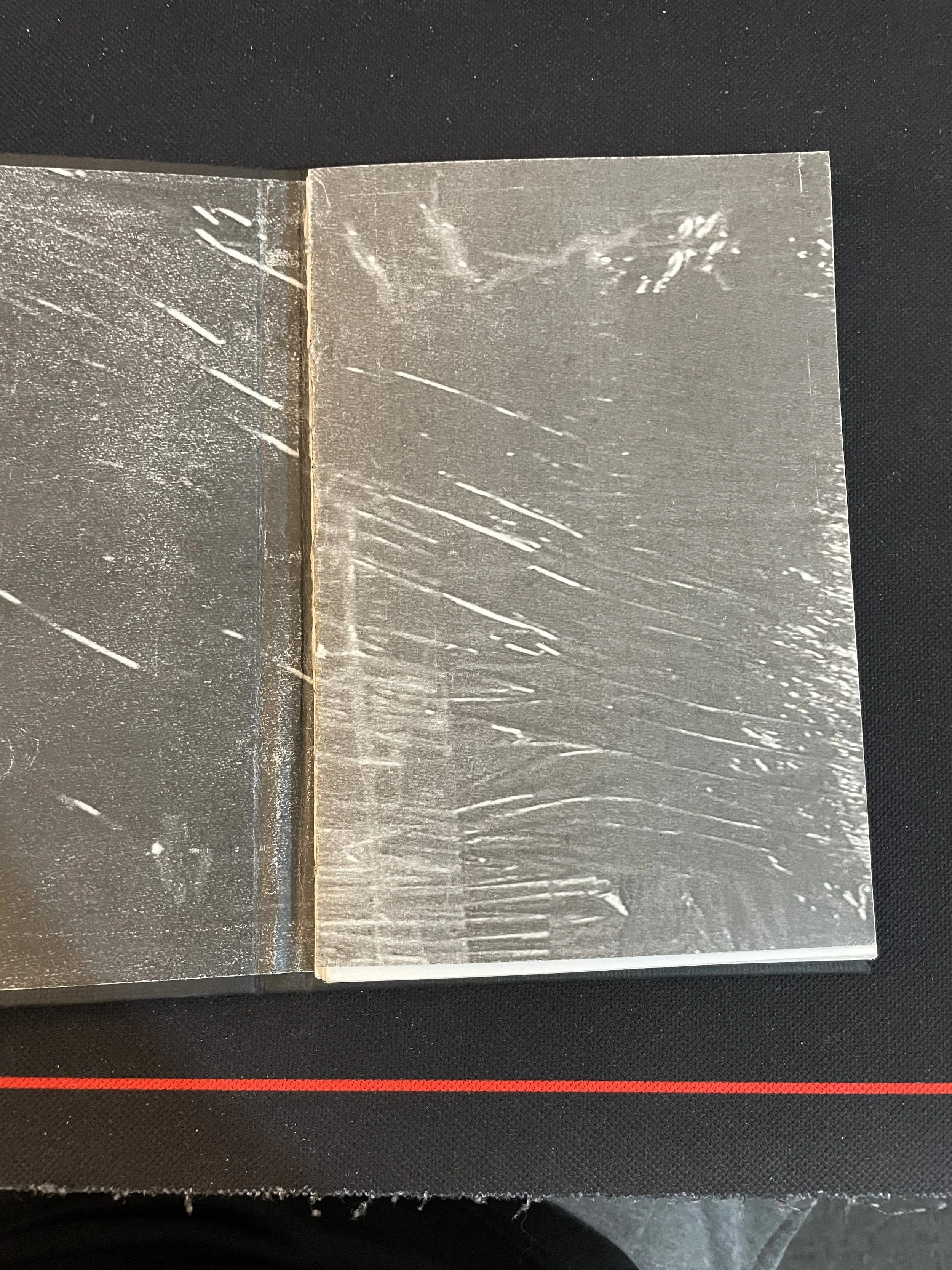
So when we knew how to do printing, it was time to think about what paper and what size is going to be my book. I knew that money are going to be really important to me. So the printing and paper can’t be expensive, because I going to print a lot of versions and it can become really expensive. I had cartridge paper and Noel gave us some papers to try how it feels and looks. I tried to print on all of them I had 100gsm, 120 gsm, and 160 gsm cartridges. 100gsm was too thin and I was able to see through. So I knew is not going to work. Next was 120gsm it was much better but it was glossy paper and it was not the texture of the paper that I was looking for. The last one was my cartridge paper with 160gsm which was good, maybe I would go for 180gsm paper, but it has a little bit warmer tone to it. Which I don’t like with black and white images. But when I put all images together on it, it seems good because I couldn’t compare it to something different. So as a cheap alternative for book dummy it was good.
Next was the size of the book. I knew when I was thinking about the book that I want it as a notebook size. Around A5 size. But A sizes are not a good ratio for images I create my own size 12cmx18cm because it is closer to a ratio of 35mm camera and I can fit 2 pages on A4 so printing is not going to be that expensive. It’s not going to be big, but not even small.
Printing and making zen in zen machine
After all of deciding and trying to print all my images. I wanted to see how my book looks. So I got the idea to make a zine in a new zine machine. So I reduce all my images to 40 pages because it maximum what can I put into the machine. I printed all of it and put it into it. It created a good zine. Is not the best quality and everything, but to see what my book is going to look like is enough. I was happy to see the zine and have something physical and not to look at the screen at all times.
With the zine, I had to create a cover for my book. While I was talking with someone and we were discussing my book we came up with an idea for the cover. The images of the address and image of the box are important to me, and it helps me to talk about the story around Christmas it would be good to create a cover from them. And to have an interesting background for it I decided to use texture from the box. So I had my first idea for the cover of my book. And I used it for zine because I was able to print it and I didn’t have to go to buy something.
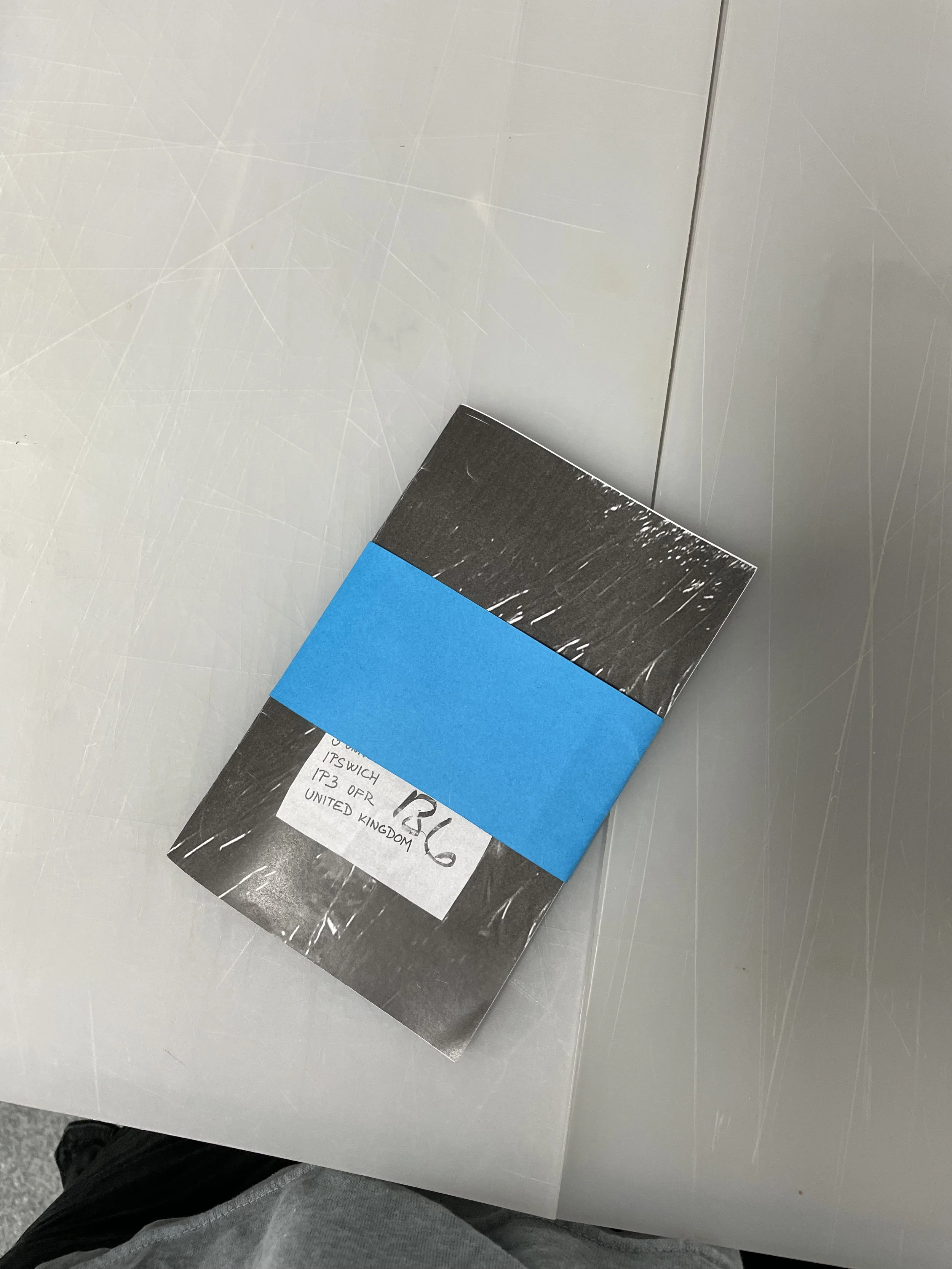
Last workshop and idea to use a band around my book
In the last workshop, Clare showed us different covers, how to do them, and other things around covers. Such as band around a book, pockets in the book. Cover, which can be unfolded and we can have a bigger image. It was very useful to get ideas to think and create a vision about our cover page. I like the band around a book. And it was something that can create something like a present under the tree from the book. Which I wanted to go this way with my book. And on the band, I would write For _______ (someone) who would buy the book. Because when we put present under the tree we write the name of a person, for who is the present.
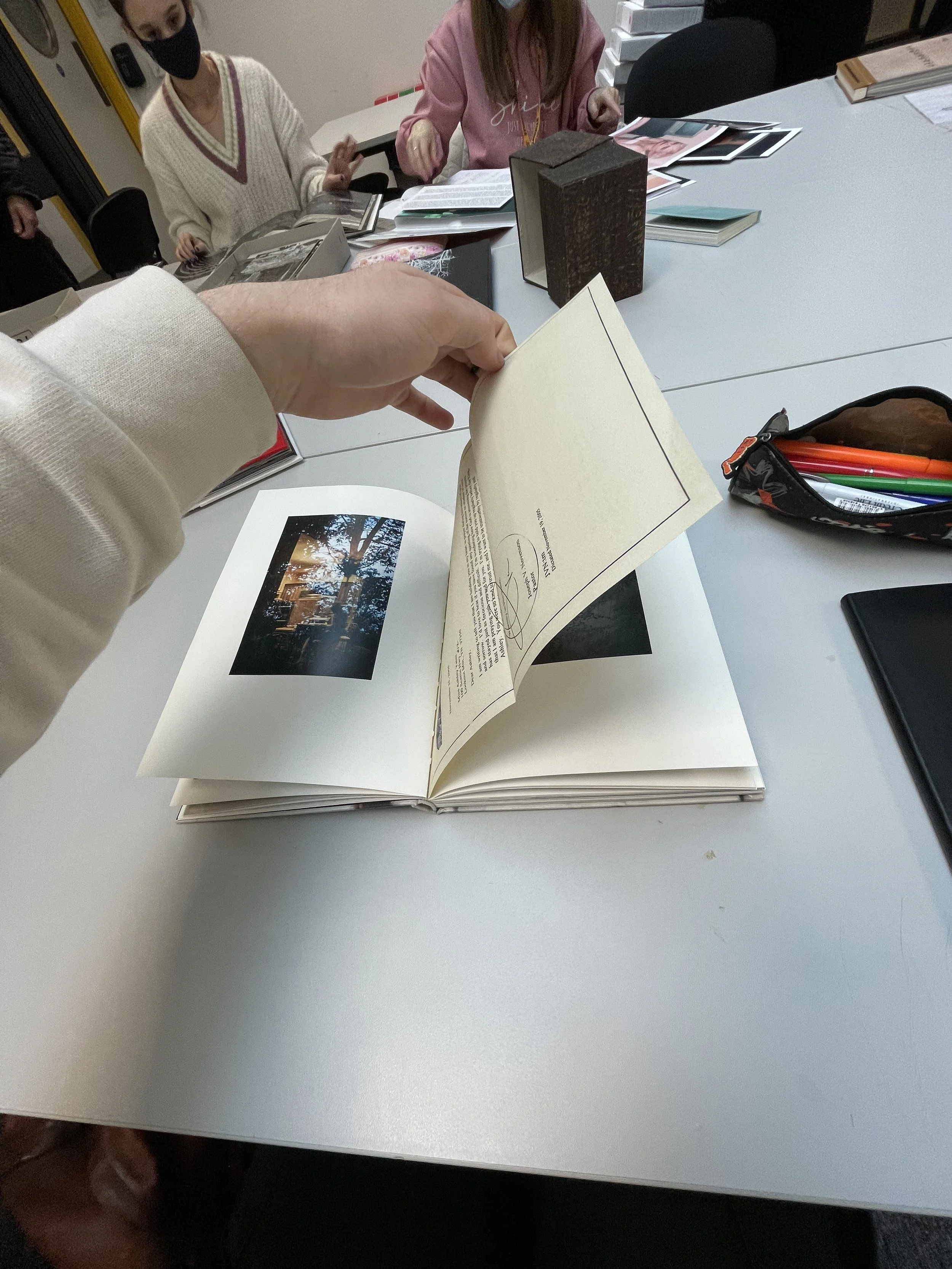
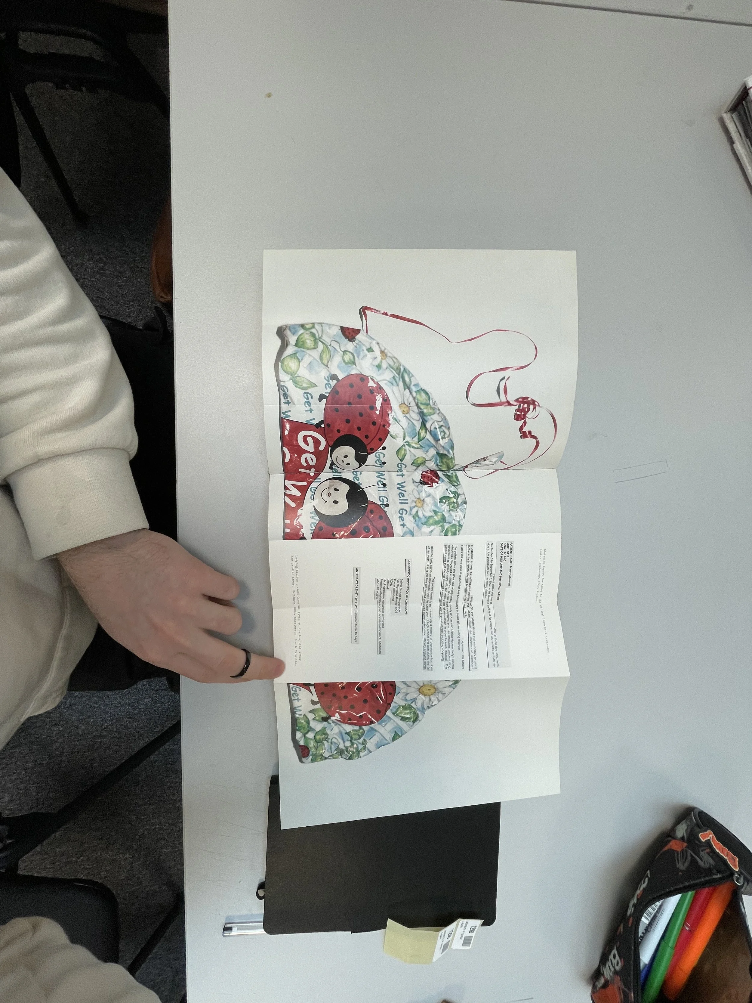
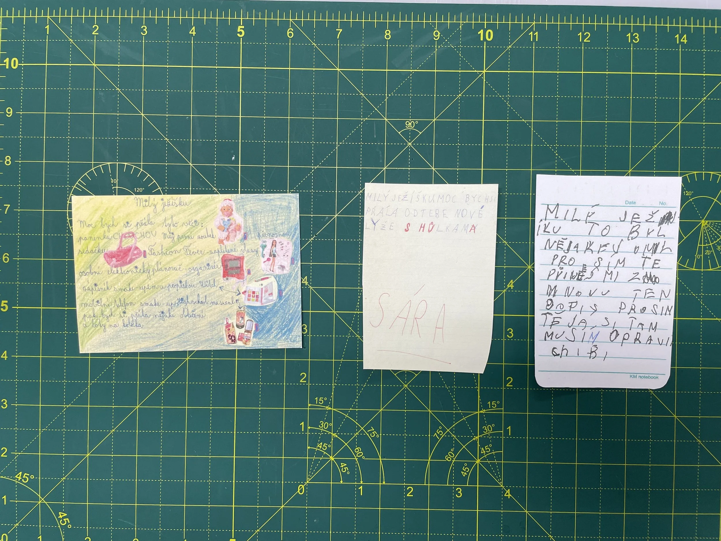
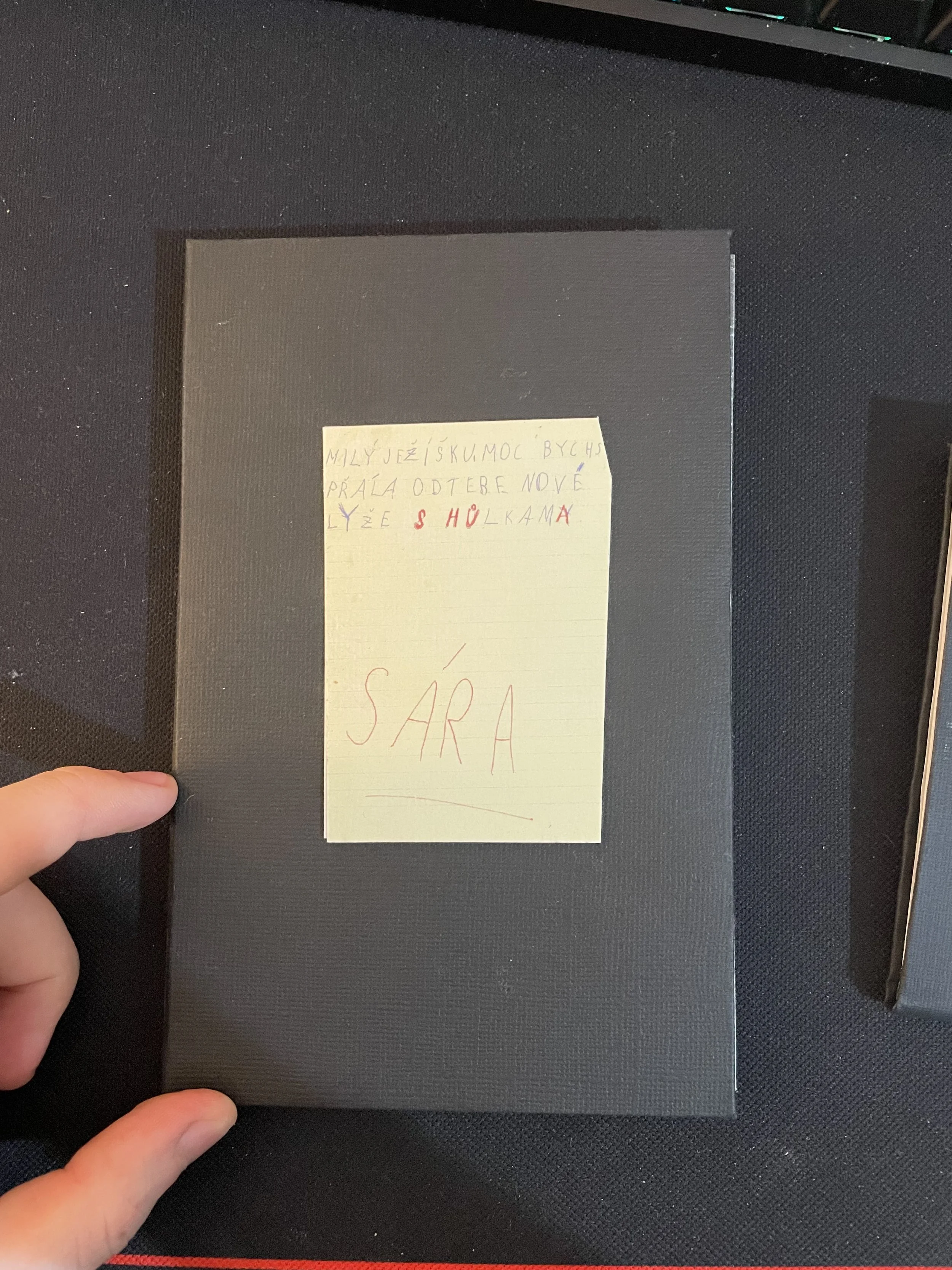
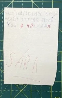
Adding a letter to Jezisek to book
In the process of making the book, looking at the different books,s and talking about it I got the idea to add something extra to the book. And it was a letter to Jezisek. It’s a letter that children are used to writing what they want get from Jezisek (it’s the Czech version of The Santa Clause). And usually put it behind their window in the room. That parents took the letter and know what their children want’s for Christmas and they don’t have to ask their children. So I asked my mum if she have my letters, but she doesn’t have them. So I asked her if she can ask her friends if they have. Later my mum send me scanned around 10 letters. Some of them were older and some of them newer. I choose to use an older one because they were from a time when I was younger and I wrote a similar one.
So now was a question of how to put them in the book. Options were to use scans and put them as images in the book. But I like that is a letter and it can be physical in the book so a person can take the letter from the book. So then it was thinking about how I’m going to put the letter in the book. And I remembered that I saw in one book, I can’t remember in which one, that the artist has a letter or something in plastic corners. So the person can take it from the book. And while it’s in the book is in a specific place whereas the author intended. And even we can hide some images under it.
So the next task for me was to choose pages where to put them. I have at the beginning of the book a smaller image, so I can hide it under the letter, that was first place. Next was one was in the middle of the book next to an image with my friend unpacking presents. And the last one I put on the last image, which covers a little bit of the image, but after we took it away we are able to see the whole image. More letters would be too much for the book. And it would become something that would interrupt the viewer.
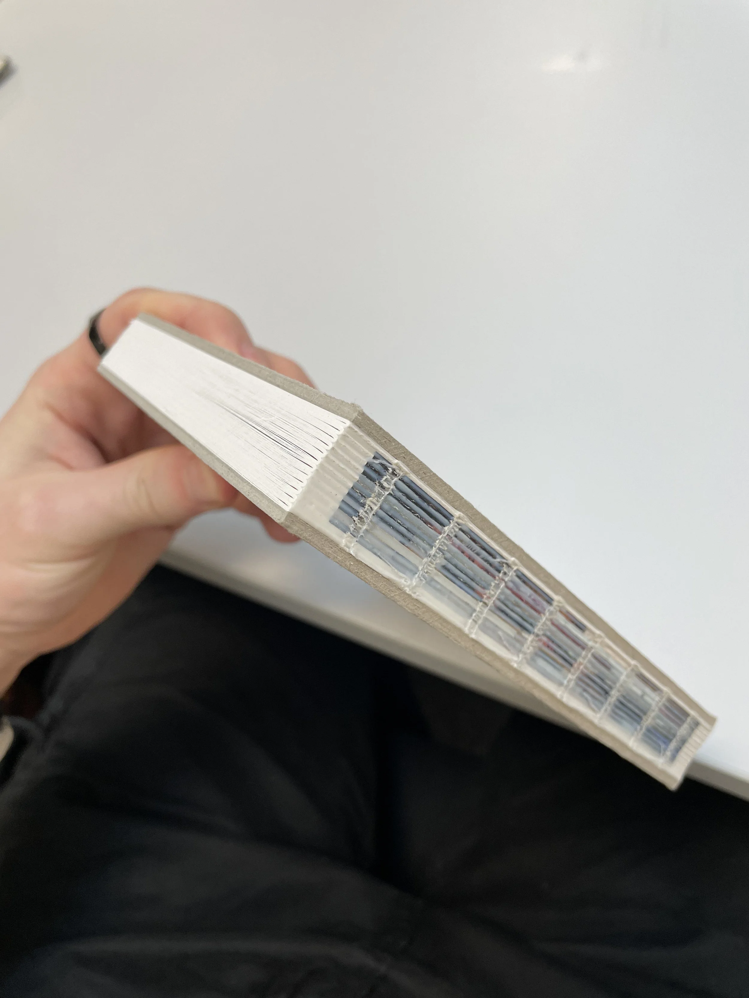
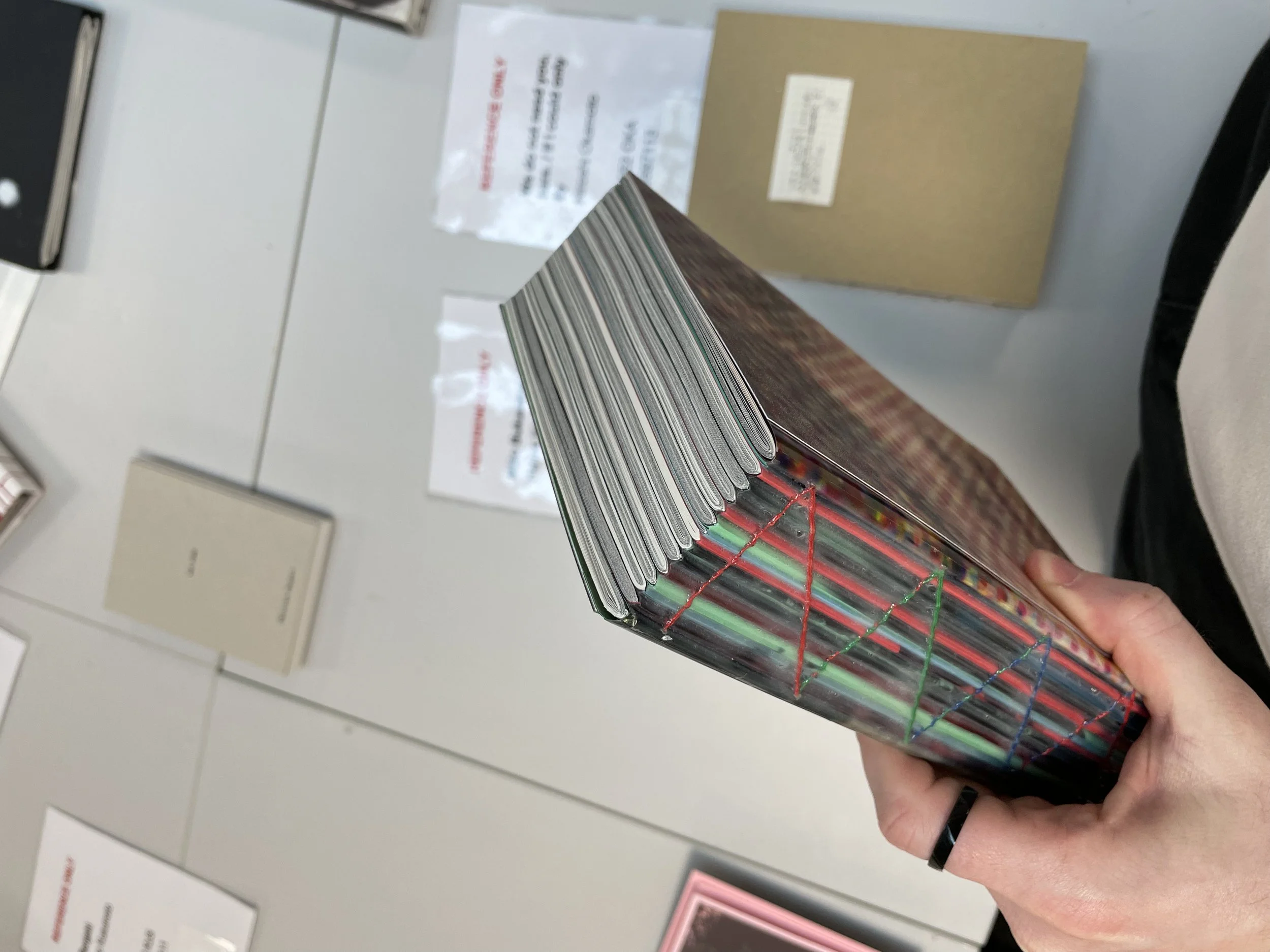
Printing and stitching non-traditional kettle stitch
I had almost everything prepared to make a book. So Again I went to inDesign and from booklet printing tool sent to printer 5 section of my book. Because we already solved almost all problems with printing it was easier for me. I used my cartridge paper and paper which we had from Noel. I knew these will be again as a book dummy and to see what is work and what is not.
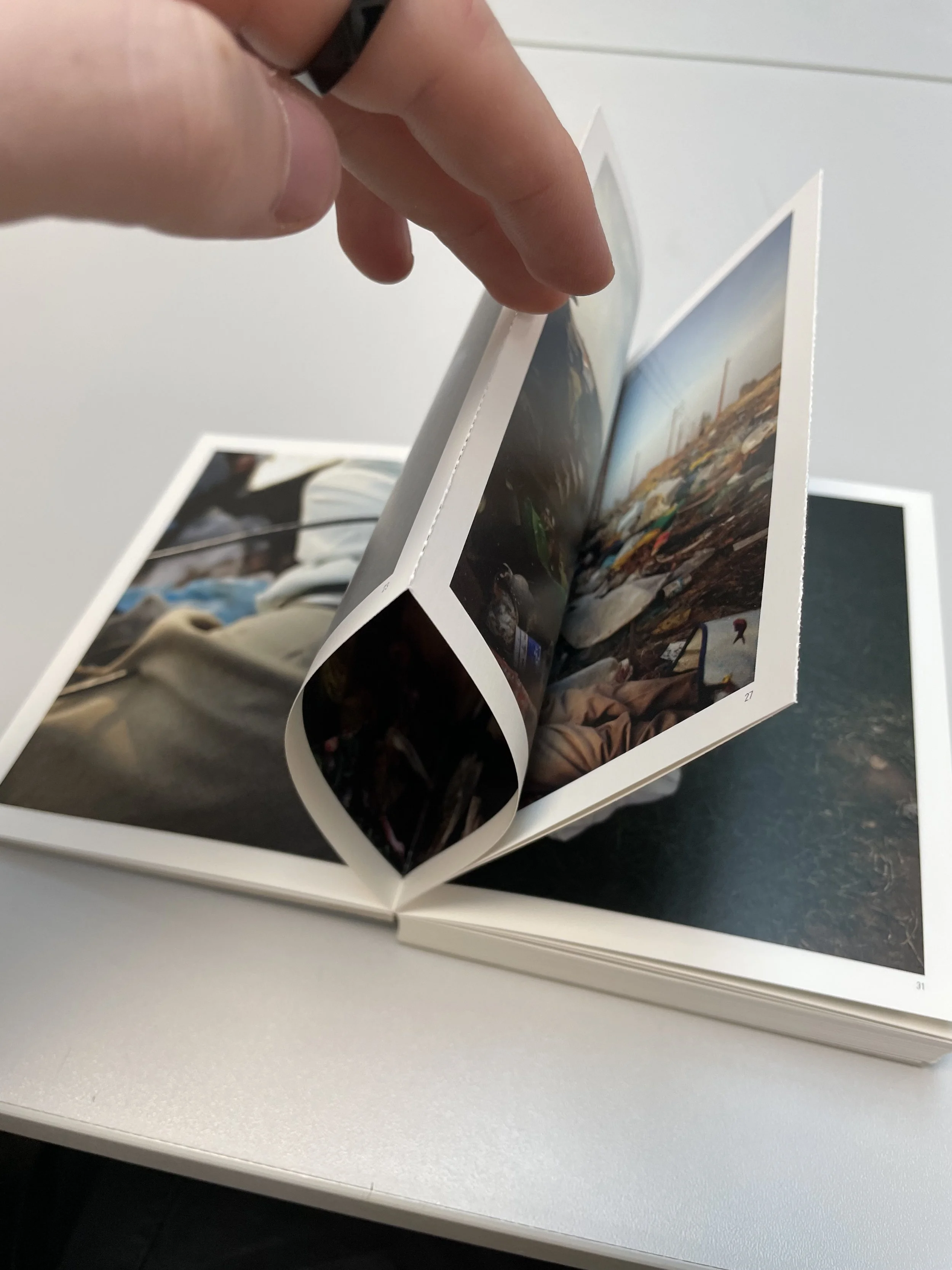
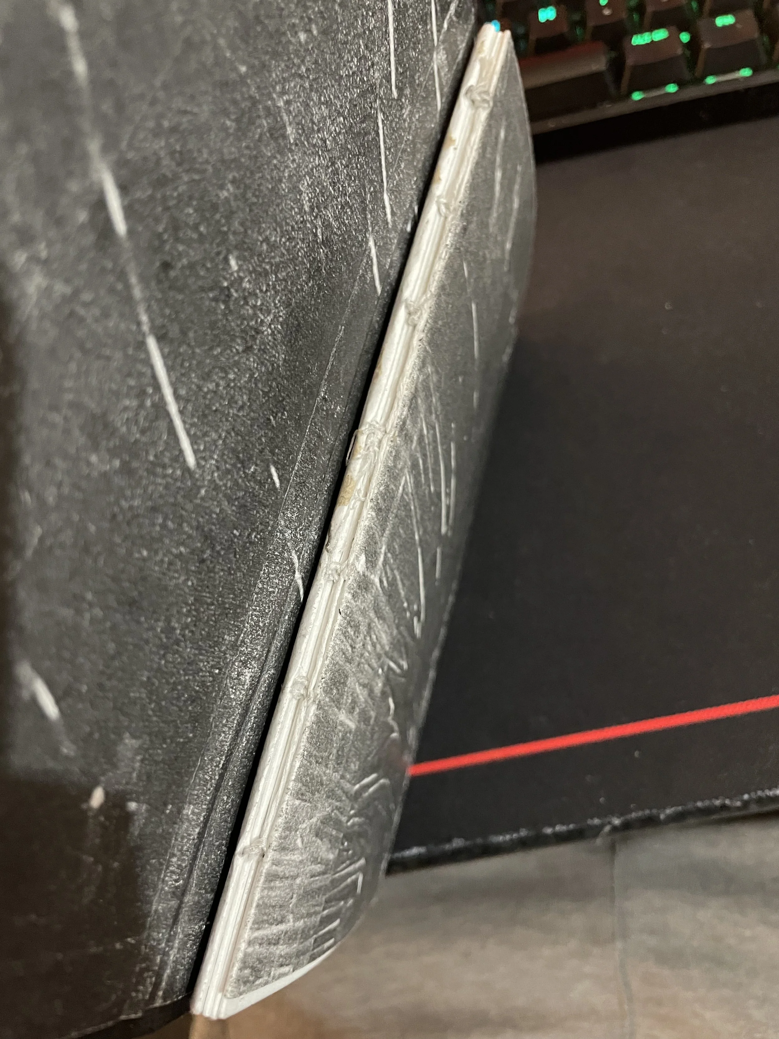
The next thing was how to stitch the book. I knew that I’m going to do Swiss bound (we are able to see the spine of the book) to all my pages will be able to lay flat. So images which are across two pages are easy to see. And it was inspired by book “Fifty High Seasons” - by Shane Lynam.
And to stitch more sections together I found a tutorial for non-tradition kettle stitch.
(link for video https://www.youtube.com/watch?v=9O4kFTOEh6k)
This stitching allows me to have more sections together and all pages can be flat. So I tried to stitch two times because I printed two versions of my book. Different papers and slightly different sequences of images. One with images of addresses at the beginning and one without it. To see the difference. The stitching was harder at the begging but with second time it was easier and I knew more about what I’m doing and what I should improve next time. I also after stitching used a guillotine to cut all edges to be smooth. But because I had already the size of my book I made it smaller by 0,5cm on each side. So I knew for next time, that I need to stitch all the pages bigger and use a guillotine to cut it to my size. Also, I glued the spine to do not have gaps between sections.
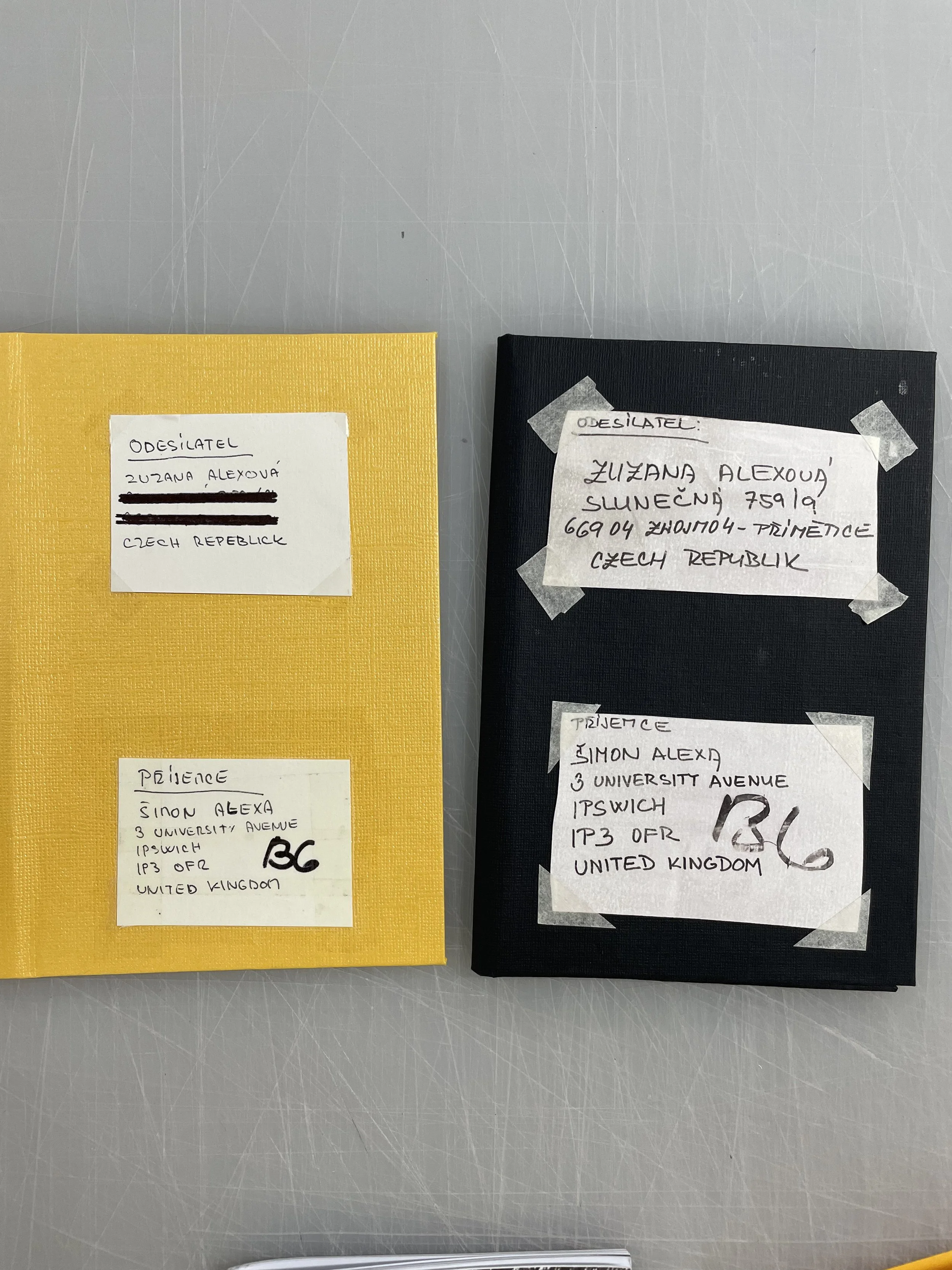
Buying “book cloth” -black and yellow
I had my pages so now was time for a cover of the book. So I went shopping in town for grey boards and book cloth. They had grey boards but not book cloth. So I bought something different that was similar to book cloth. It was a thicker paper with the same details on one side. But I like it, and it quite reminds me of the structure of the box from my mum. So I bought a black one and a yellow one to see how it going to work. It was a little bit bigger than A4 so I knew I can also create from them band over the book.

Cover making
The next day I bring all of it to school and started to work on covers. I made a yellow one and a black one to see which is better. I also create one with a hard spine and one without it. Again to see the difference. After I did it I realize that I’m going to use a back cover with a hard spine. It suits more to the concept of the book. And hard spine looks better and feels better.
The next task for me was to figure out what to put on to cover. My ideas were
Address from box
Write new with my handwriting
Use images
Name of a book and my name
Image of letter to Jezisek
With the name of the book and my name
Without the name of the book but with my name
Print cover what I used on zine
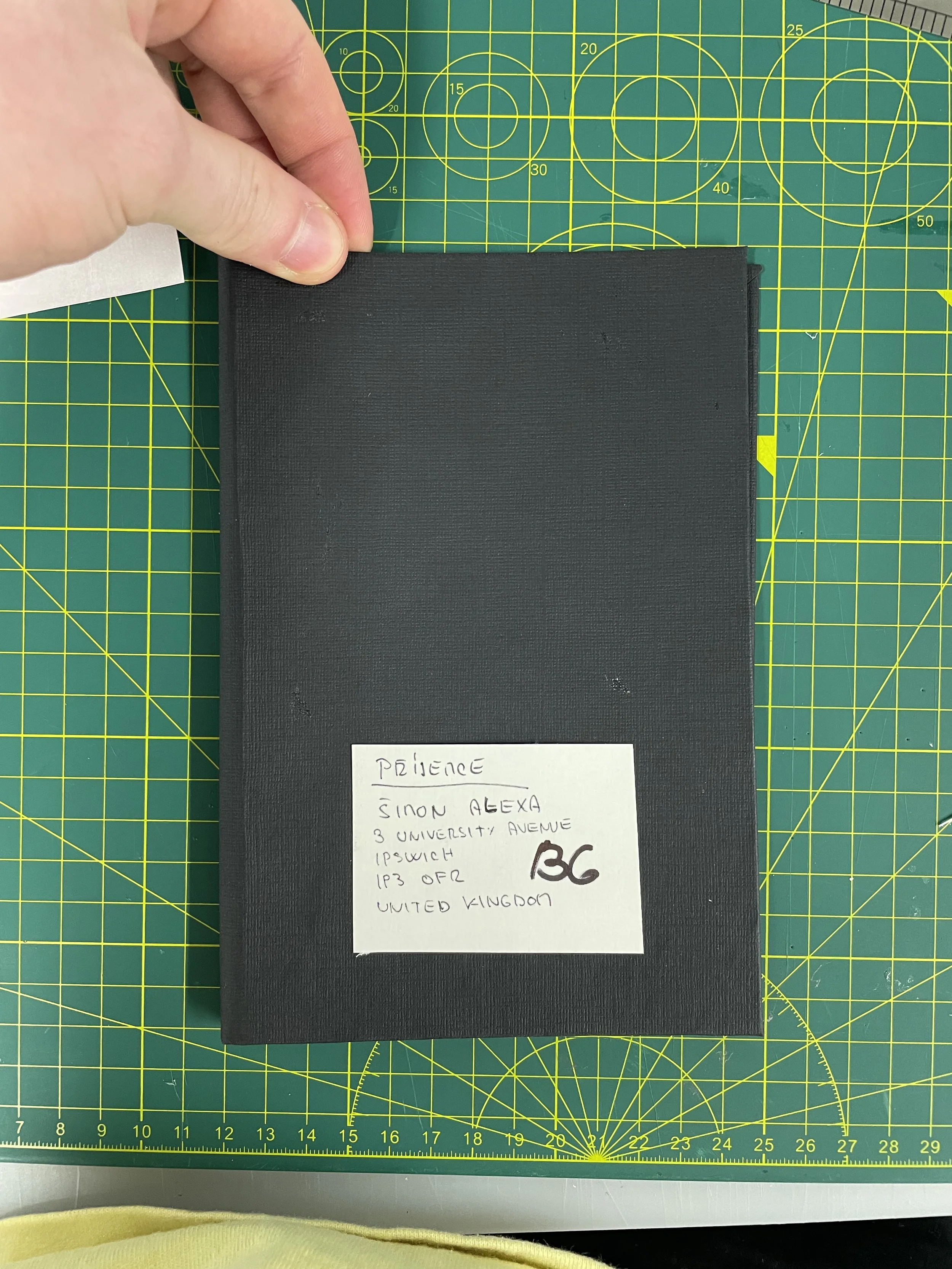
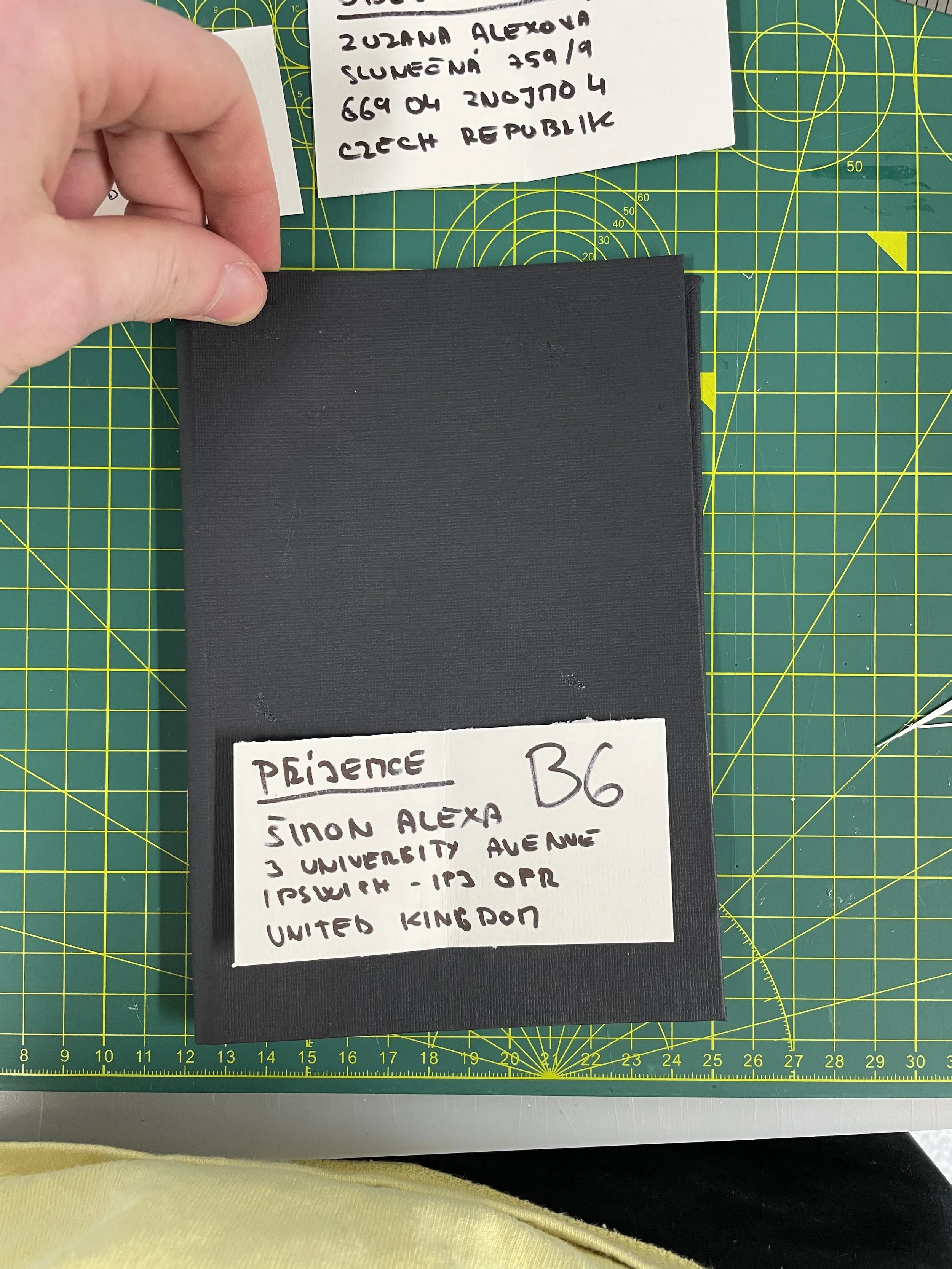
After trying to come up with all the ideas and creating them I decided with help of Noel and classmates to go with masking tape, it looks best on the black cover and it can simulate a little bit the addresses on the box. It’s not true to life, but it’s better looking than normal tape or other tapes. So I had my cover. Also, I created a band around the book in back and yellow. And the black band with a black cover looks better so I’m going to use it. But the question is what to write there and how. I can stick with the idea of writing for ———— (someone) or try to think about something else.
I also picked two versions for the final cover. In front of the book, I will have tape at top of the paper and it’s going to be glued to the cover, to hold there. And at the bottom side of the cover will be tape all around the address and have a corner and ripped tape by hand not cut which is straight.
I also tried to write it in my handwriting of it’s going to be better or not. I tried it twice. But the original address from the images was much better. And also it feels more authentic.
2nd more informal crit - already made a book dummy
Then we had 2nd crit, it was a more informal crit. I brought zine, 2 covers, and 2 stitched images in sequence, and in one of them were letters to Jezisek. I got good feedback on my book and idea around it. We talked about the covers and end pages what I can do. Also, the fact that all letters are in the Czech language. So the question was if I will translate it or not. And I like that they are in Czech and the book is about me and my friends celebrating Czech Christmas. And this unknown Christmas for other people. So my response was that I won’t translate it. And Noel to this pointed out that it will be good if I will put at least a note or something that people should use a translator to know what the letter is saying. Because it’s quite an important part of the book. But on the other hand, I’m trying to play with the unknown and unrecognized Christmas. So the letter is an unknown cause of the language.
For the end pages, we got the idea to have the image of the package that my mum sent me without the address or use a letter or collage of letter as an end page. I liked the idea of the image of the package. And another idea was about if I should use images of addresses in the book and then use them on the cover. And we agreed that it will be good to have them both, on the cover and in the book. Noel pointed out that it would maybe be good to have one at the beginning and the second one at the end of the book. But I like it more have both of them in front of the book as induction for the book. And I already have my images for the end of the book. And it was quite already built around it.
Another thing that we discuss, what was for all, was the text in the book. That it should be big, smaller text is better and also it should be in one line or in one box through the whole book. So in my book, I had text upper the other one. So I knew I needed to fix it later.
Finishing sequence and whole layup of book
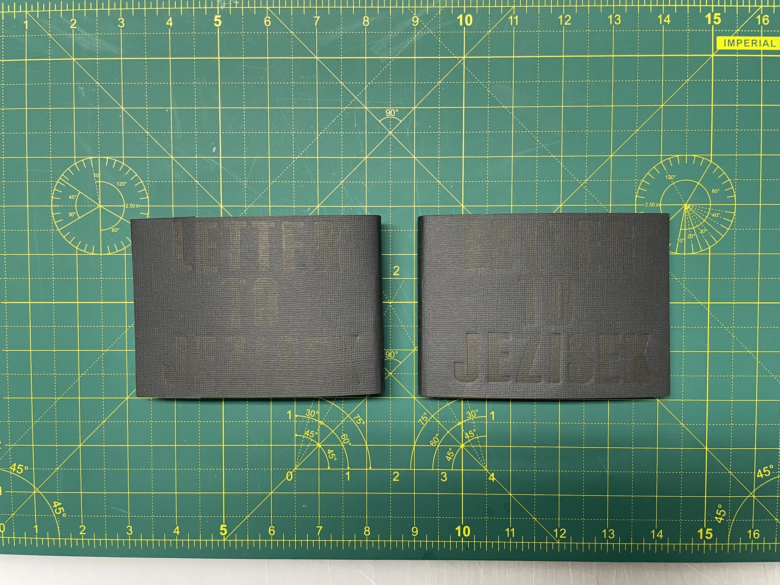
After the crit, I knew I’m in the right direction with my book and I need to do change just a few things and more to enhance all the aspects of the book. So I started with the layout of the book. I added a page with the name of the book and my name. So I had to come up with the name. After some thinking, I came up with the name “Letter to Jezisek” (Ježíšek in Czech). It’s unknown as a book. It’s part of the book and its symbol of Christmas in Czech for children. It has more meanings and it’s connected to the narrative. Then I add pages with dedication. I want to dedicate it to my mum. For many reasons.
Then I edit all my images and converted the colored images to black and white to get the best result. I tried to preserve all images as they were shot on film. I adjust the bad scanning process. The last thing was to adjust the sequence of images if it needs it. It was almost perfect. I just changed a few pictures so that I didn't have two double-spread pictures next to each other. And have a more balanced sequence. And they should have the same size or similar composition next to each other. It should feel engaging all the time.
End pages
The next thing that I needed to do were end pages. I knew that I want to do the image of the package from my mum. So I printed it out and do it with the first cover. Then I got an idea just to see if I can use black paper if it is better or not. And it was not. I liked more end pages with the image of the package. I also use Swiss bound on one book so I just glue back of the content in the book and the front wasn’t. So the viewer is able to see the spine. In the other book, I glue the front and back so the spine is not visible. But I stick with the original idea to have Swiss bound.
Making band overbook with letterpress
Nathan had arranged an induction for the ink (letter) press with Glen. I joined him to try it and see if I can make it something and implement it in my book. Either way, it was a good opportunity to try something new and exciting. I tried to print something on the band over the book and it looked really good. I didn’t expect that it was going to be that good. I wanted to try it do on the covers of the book. But the pressure would destroy my spine so I didn’t try it. But I have my cover finished so it wasn’t necessary to do it. But the black band with black ink look really good and it was embossed to the paper which gave it better details. So I knew I going to replace the idea of a name for someone on the band and do this one. It’s looking better and I will have the name of the book on the cover. Not exactly, but it’s going to be there.

Making final book (struggles)
I had everything done with the book so the only task for me was to make a final book. As we progressed with the module we discussed that we can print on cheap paper and a cheap printer. So I thought that I still have cartridge paper. But I didn’t so I buy another pack and with that, I found a cheap matt 180gsm paper. So I bought it to see how it looks. Either way, I wanted to create at least 2 versions of the final book to hand in the better one. So I waited 2 days for the paper. After the paper was delivered I was able to start making a final book. Firstly I started to make books with cartridge paper. It went well until I realise that I trim one section 0,5 more than the other ones. But I knew that I’m going to do another one. At least I’m will try again to do the whole book and make the second one even better. I also bought a different thread to try it. But it was worse. The strings didn’t stick together and it looked worse, so I went back to the old one for the next book.
The second final book went faster and smoother. The Paper looked better than the cartridge paper in terms of the scale of black color. But it’s called matt paper but still, it feels glossy. But it’s cheap paper so I didn’t expect it to be good. And it’s white and I prefer more with black and white images more than some warmer or colder tint to paper.
Before I started to do the final book I wrote a synopsis for the book. Noel helped me with grammar after I wrote the text.
Synopsis:
“In September 2020, I left my home to begin a new life in the United Kingdom.
The Christmas holidays have always been a period where I looked forward to seeing my family. However, with the onset of the Corona Virus and its subsequent restrictions, I was forced to stay in England and celebrate Christmas with my friends from the Czech, who had to stay for the same reasons. We celebrated the holidays and we enjoyed the presence of each other. Some moments were lonely, some of them were full of happiness and gratefulness.
Despite the fact that we were in England, we still celebrated Christmas with Czech traditions. We didn’t have a lot of things, but we still were able to enjoy it as much as we could.”
Second thing was to write a not for the viewer to translate. But I thought it would be a shame if I would just put a note to the book. So I had the other two-letter without the backside. So on the letter which is in the middle, I wrote the note to use google translator or send me a message and I will send them back-translated version. I also shortly explained what this letter means.
Before I start I got the idea while I was looking at Alec Soth’s “A Pound of Pictures”, there were prints in the book. And I got the idea to put prints on my book as well. Because it can be like a little present. And it just underlines the idea of Christmas in my book. So I printed 4 images on better paper and signed them and put them on the last two blank pages.
Everything went right with the making I let the glued spine dry overnight then the next day I did cover and glued end pages, again let it dry overnight and 3rd day I made letters and put them in the book. The only thing that was left was band over book. I took 2 bands to have at least two attempts. And the second one was better so I will use it.
Because I did everything before it was the same process, but with more knowledge and know-how on how to do everything and what not to do. I didn’t make any mistakes so I dan my final book. Of course, it has some mistakes, but I would have to do so many books to have it without any mistake. Then I took images and videos of my book in the studio with lights and a better camera. I will upload them later on my website.
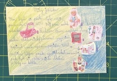
Dear Jezisek,
I would like to get these things: doll, my first tooth, portable seat, personal electric notepad, notebook, mobile phone with High school musical theme than I would like to get some clothes and shoes on wheels
Dear Jezisek, I would like to get from you new skis and poles
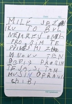
Dear Jezisek, it was some mistake. Please can you give me the letter back, I have to correct my mistakes.
On the back of this one, I made one mistake and had to correct it with a pen. But I feel like the meaning of this letter it’s a little bit funny. So didn’t reprint it.
Self-evaluation
When I started with this module I didn’t know what to expect. And I was a little bit afraid of how much money I will have to invest in it. But my worries were unnecessary because I was able to do many book dummies, all things for the workshop, and 2 final books under £50. But I would say money can make it really easier, and you can experiment much more with different kinds of paper, different printers, and printing techniques. Then you can buy a lot of different types of book cloth or other types of covers. Then you can print on them or do different things. But overall I would say the process of bookmaking is pretty expensive and when you start to work with other people it’s even more expensive.
I’m happy that I took quite a different type of images then I’m used to it. I think that this type of work suits more book medium than my regular images. Try to communicate more with the idea and narrative than just with the visual site of images.
The whole process was interesting and I spent more on actually making the book than on writing about or researching. Which I really like and I was able to spend thinking and doing more ideas.
I guess one of the hardest parts of making was making the sequence and designing the book. It’s still a new thing to me.
Overall I’m satisfied with the final book and how I made it. I would like to make around 5 copies and give them to my friends who celebrated Christmas with me and to my mum. If some of the books would left, I would try to sell them I someone would like to buy them. I will see.
Fifty high Seasons - Sahne Lynam
Fifty high Seasons from Irish photographer Sahne Lynam. His work is focusing on the built environment and looks to question some of the ideas that shape public spaces. His latest book was self-published. After pre-selling 260 copies of Fifty High Seasons in June 2017, Shane was able to self-published the book on his own terms in September 2018 and create more his vision and be completely able to do everything without the limitation of others.
The book is called Fifty high Seasons and it is a reference to the 50 years of tourism that began when La Mission Racine was finished. This resort was built between Montpellier and Perpignan on the French coast. These residents were built on initiation from President de Gaulle in 1963. Architects were hired to build innovative and unique spaces for French people which will be fitting to the local environment. t was built for French people to have space where to spend their holidays and it would have not been as expensive as other residences for example Cote d'Azur, but that wasn’t the only purpose. The resorts were built also to support an income for the local region. Shane Lynam was spending his summer holidays there from 2003 and documenting architecture and surroundings. But started to make this project in 2010. It was also a place for him where he went when something happened in his life.
Lynam also has people in images who are spending their time there, not through a portrait, but through images where people are in the background but still we can see how they look like or what they wear. They are usually sunbathing or wandering around. He said that he spent France a lot of time in and the thing that he start to understand French people.
Through the book, we can spot a pastel colour palette. Which is in images, and at the same time in blank pages which are frequently in the book. It contains predominately landscape images and just on a few of them, we can see people as I mentioned before.
We can get a lot of different feelings from the book. While looking at the image we can get feel we are looking at an apocalypse movie where we can’t spot any living soul and only abandoned buildings remain. On the other hand, while flicking through the images we can get the feeling of last summer sun, while we are on the beach sunbathing. And everybody already left the resort. The image reminds more 1960’s times with all the colours and architecture rather than recent years.
The cover of the book has a hardback with 116 pages and 48 images. Book has 14 sections with the Swiss bound. Binding allows pages to lay completely flat so that the viewer is able to see every detail of the image. Pages are matte-finished which support soft plate colours. Design by Joseph Miceli and publishing consulting Andrew Miksys.
Tyler Mitchel
Tyler Mitchel young photographer who basically learns how to take images on Youtube and Tumbler. Later on, he went to art school in New York. His work explores and documents a new aesthetic of Blackness. He is using many genres and media from fashion photography, commercial work to video work. He is trying to represent black people more than he was used to when he was young.
In his first book “I Can Make You Feel Good” are full-size image spreads. Usually, the edit of images is a portrait and it’s followed with a close-up on the other page. He is using matt paper with a large-scale book (12.5 x 9.5 inches) and a signature candy-colored palette coming from a medium analog camera. In the book, we will not spot any white spot, which goes with the vision of the author to create portray the young Black men and women with intimacy and optimism. And glowing natural light and rich color help him to reach it. Mitchel wants to show black people how they are enjoying life because as he said, it should be shown and it’s important to be shown. Mitchel trying to create the dream and to create a utopia. Where it would be free of racial prejudice that still shapes our contemporary world.
The book is a mix of documentary reportage, portraiture, fashion photography, art photography, and filmmaking as his work outside of this project. Some of the images look like it was planned before and he took time to prepare them before shooting. On the other hand, we can also see an image that reminds us like they would be shot spontaneously. He is using memories from his childhood and how it was to grow up as a black boy and what the South of America looks like for him
Through the book, we can spot symbols in the form of water guns or plastic resin chains. It’s a reminder that the black body is still politicized.
This book came from his first US solo exhibition at the International Center of Photography (ICP) in New York. And was published in 2020.
At the beginning of the book, Tyler wrote the introduction to the book. Book also contains contributions from Hans Ulrich Obrist, Deborah Willis, Mirjam Kooiman, Isolde Brielmaier.